Implementing an Atomic Design System
Designed Atomic Design Systems (ADS) to minimize design build time and maintain consistency across all platforms

Timeline
4 months
Teams
UX Designer (Myself), Product Managers, Developers, and Stakeholders (CEO, CTO, and VP of Product)
Overview
As Magicbricks continues to grow, both as a product and a company, we refined the brand identity and apply it cohesively to our products. Which ultimately leads to better productivity and efficiency, which in turn improves the customer experience and business ROI.
I observed that we frequently created similar components, such as buttons, forms, and headers, multiple times. There were over 45 button styles and numerous hex codes for our primary color, red. This caused confusion among developers and designers, who were unsure about which buttons and colors to use in various contexts. Our existing design system, a Sketch component library, was outdated and lacked the flexibility needed, leading to poor adoption by the teams.
To address these issues, we implemented an Atomic Design System. This new system provided a consistent user experience and significantly increased the efficiency of our development and design processes.
Challange
Before I implemented Magicbricks’ Atomic design system, each development team was creating their own styles and components for their specific projects. This meant that things like colors, buttons, icons, dialogs, and tuples were being built multiple times by different teams, leading to inconsistency and confusion for users.
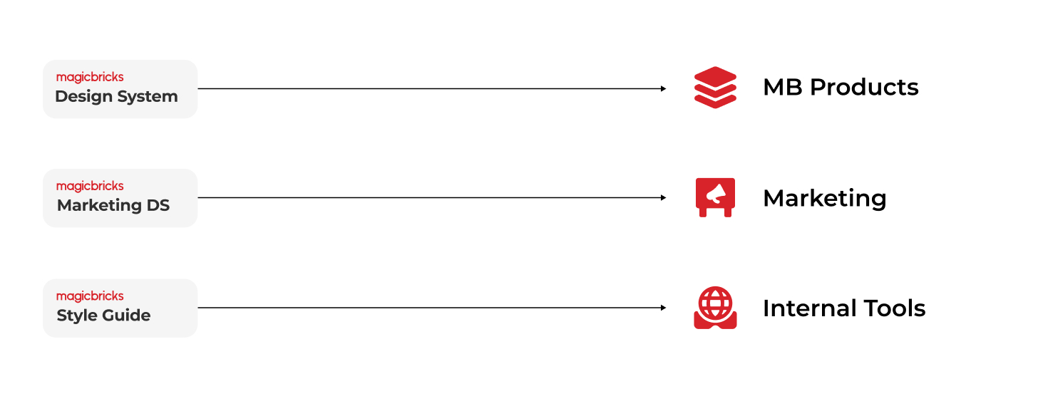
As I dug into this problem, I also found out that we had three different design systems for our MB products, marketing, and internal tools. Each of these systems had its own style, none of which were aligned with Magicbricks’ brand guidelines. This lack of alignment was causing even more inconsistency and making it harder to maintain a cohesive brand identity.
Solution
To tackle this issue, I implemented an Atomic design system, which standardized our approach to design across all teams. This system ensured that every component and style was consistent and reusable, significantly reducing redundancy and enhancing the user experience.
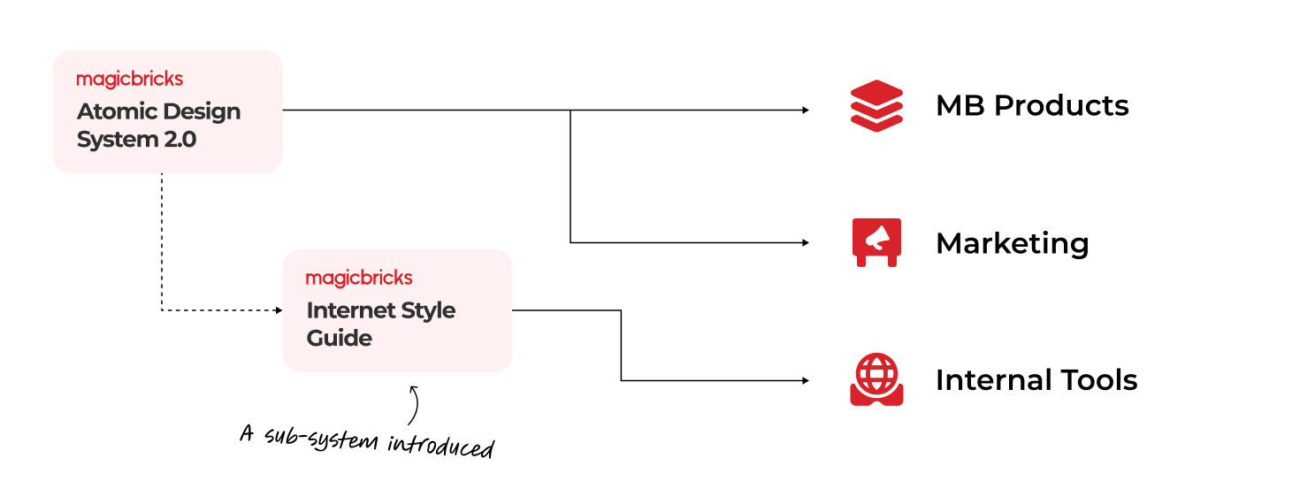
Consolidating two design systems
I consolidated both MB Products and Marketing design systems to create one unified Design System. Within this new system, I introduced a sub-system specifically for our internal tools. This sub-system addressed the unique design requirements of our internal teams while still aligning with the broader Atomic design principles.
Atomic Design System
Atomic design is not a linear process, but rather a mental model to help us think of our user interfaces as both a cohesive whole and a collection of parts at the same time. Each of the five stages plays a key role in the hierarchy of our interface design systems.
Goals
- Design debt reduction (cohesive brand & UX)
- More focus on UX & specialties (no redundancies)
- Speeding up the processes (design, handover, code)

Atom
Atoms are the basic foundational building blocks. It involves all our user interfaces. These atoms include basic elements like color, typography, shapes, and others that can’t be broken down any further without ceasing to be functional.
Typefaces
Montserrat is the primary brand typeface for Magicbricks. It was designed to be incredibly versatile with lots of range in terms of tone and playfulness. We found it user-friendly, stable, and professional to end users.
Damion is our supporting font. It’s carefully chosen to add a character to our typography, which makes us very different from our competitors. We have only used to emphasize certain words in the heading to add some expressiveness.

Type scale
The typographic scale is designed to keep the number of separate styles to the minimum which works for the Magicbricks.

Colors
The new palette for Magicbricks consolidates interface colors to clearly communicate things like interactive state, hierarchy, and emphasis of elements on the screen. Magicbricks brand colors are less prominent, which lets merchants concentrate on their own brand and business.

Grey Color palette
Grey colors are used for text, icons and background color.

The 60-30-10 rule
The 60-30-10 Rule helps to visually organize color, keeping the design, from getting cluttered and confusing with too much color usage.
The 60% + 30% + 10% proportion is meant to give balance to the colors. This formula works because it creates a sense of balance and allows the eye to move comfortably from one focal point to the next.

Grid & Spacing
Horizontal & Vertical Spacing
We define spacing to create a visual structure. 8px spacing is used throughout the product. 8px is halved to produce a 4px spacing for micro adjustment.
This spacing scale is used within an element or space between elements from one another. Further, this spacing scale is based on the baseline an column grid.

Baseline grid
We have used 4px for baseline. All text flows vertically along this baseline, creating a similar rhythm across all screens. This rhythm is created using line height between each line of text and the margin between elements.

Desktop Column Grid
The grid is the foundation for positioning elements onscreen. Designing the grid helps create seamless, easy-to-follow experiences and brings order to the page.

Mobile Column Grid
The mobile is followed for all mobile platforms including mSite, Android app, and iOS app. A base width of 360px will be followed for all designs.

Shape & Depth
Rounded-radius components (Card & Dialog Box)
- Small components as tags 4px
- Components such as cards, tooltips, dialogs, and buttons to an 8px radius

Rounded components
- Components such as tag, chips, CTA, and other shapes can 50% rounded

Shadow

Iconography
Icons are a crucial part of any design system or product experience. Icons help us quickly navigate. They’re really small, so they don’t take up very much real estate. They’re the foundational building block of illustrated content.
Organization
Let’s start with file naming. Your icons should be named based on what they show, not what they represent. For instance, a lightbulb should be called a lightbulb, not an idea.
size > category > file name.
Things to Avoid
- Strokes
- Blending Modes
- Masking
- Multi-level Grouping
- Transform / Translate
Types of icons
- Monochrome (Single Color)
- Multichrome (Two or more colors that will not be altered in UI Development)
- Animated (Colors will not be altered. Animation will not be altered)
Color
Grey-900, Grey-700, Grey-500
Size & Grid
We are using a 4px grid to define the icon. We are limiting the icon sizes to maintain consistency
Molecule
Molecules are the smallest fundamental units. We can combine the same atoms in different ways to create unique molecules for use in our design. For example, the input text field is combined with typography, color, and spacing. Dropdown is also created using the same atoms.
Actions

Form Fields

UI Elements

Organism
The organism is group of molecules joined together to form a relatively complex, distinct section on an interface. For example, a locality card is a combination of multiple CTAs, icons, and typography. Organisms demonstrate those smaller, simpler reusable components.
Component

Widgets

Template
A template is where we begin to curate our organisms and other elements into a cohesive design. We can see the design coming together and the layout in action. In this stage, it’s easy to visualize the user interface and how can they compose each of the pages.
Sections


Impact
The implementation of an atomic design system has helped us achieve consistency in design, reduce design and development time, and improve collaboration between designers and developers. We are now able to create high-quality products more efficiently. Here are the outcomes:
-
Designers can easily access and utilize components from the Sketch library.
-
Centralized storage for both components and projects.
-
Reduced component styling work for engineering teams.
- 10% reduction in time spent on QA per sprint.
Conclusion
At the start, the atomic design approach will require plenty of extra effort to implement. But in the long run, it will all pay off. You don’t just create a bunch of buttons and pages. You create a system. A system that is fully documented and can be scaled for dozens of projects.